Do Retrograde Stations Mark Market Turns? We Tested 264 of Them
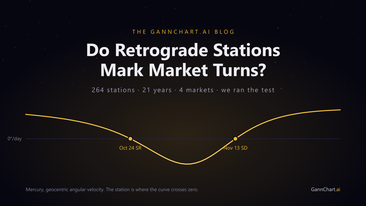
"The planet turns, the market turns." It is one of the most repeated claims in astro-trading, and it is easy to believe, because when you drop station dates onto a chart you really do see them landing near highs and lows. So we tested it properly: 264 stations, 21 years, four markets, against a random-date baseline. The claim did not survive. This article shows the method, the data, and the one part of it that is still worth keeping.
- A station is the instant a planet's apparent angular velocity crosses zero. It is real, physical, and computable to the minute. Nothing mystical about it.
- We tested 264 stations (Mercury through Saturn, 2005 to 2026) against swing pivots in gold, the S&P 500, WTI crude and the Dow, across 48 combinations of pivot strictness and date tolerance.
- Station dates landed near pivots no more often than random dates. Mean lift over baseline: 0.91x. Configurations reaching significance: 0 of 48. Best p-value anywhere in the sweep: 0.17.
- The reason it looks like it works is the thing worth learning: with a normal pivot definition, roughly two thirds of all trading days already sit within three days of some pivot. Any date scores about 67%.
- What survives is narrower and more honest: a station is a time coordinate, not a signal. Gann never used time alone. Time had to meet price, and that is a different claim with a different test.
First, what a station actually is
Planets do not reverse direction. Retrograde motion is a perspective effect. We observe from a moving platform, and when Earth overtakes an outer planet on the inside track, that planet appears to slide backwards against the fixed stars for a few weeks. Mercury and Venus produce the same illusion in the opposite geometry, swinging past us on the inside of their own orbits.
The station is the hinge. It is the moment the apparent motion stops, right before it flips sign. Written out, a planet's geocentric velocity is just the rate of change of its ecliptic longitude:
That last line is the one bug everybody writes at least once. Longitude is a circular quantity. When a planet steps from 359.7 degrees to 0.2 degrees it has moved forward by half a degree, not backwards by 359.5. Skip the wrap and your code will report a spectacular fake station every time a planet crosses the Aries point.
Because a station is defined by a sign change, you can find it exactly. Sample the velocity daily, find the day the sign flips, then bisect that interval until the velocity is arbitrarily close to zero. Every station date in this article was computed that way, to the minute, using the same ephemeris that drives the charts in the app.
A station is a zone, not an instant
Knowing the station to the minute is satisfying and slightly misleading. Near the turn the planet is barely moving at all, so the days either side are nearly indistinguishable from the station itself. We measured how wide that slow zone really is, across every Mercury, Venus and Mars station from 2005 to 2026:
| Planet | Threshold | Stations | Median | Min | Max |
|---|---|---|---|---|---|
| Mercury | 0.25°/day | 136 | 8 days | 6 | 14 |
| Venus | 0.15°/day | 26 | 9 days | 8 | 11 |
| Mars | 0.08°/day | 20 | 13 days | 11 | 13 |
For scale: across 2015 to 2026 Mercury averaged 1.315° per day overall, but only 0.158° per day within two and a half days of a station. That is roughly eight times slower (n = 350 near-station days versus 3,669 other days). So the planet really is doing something distinctive around the station. The open question is whether the market cares.
The claim, stated so it can fail
Vague claims cannot be tested, so here is the sharp version, which is also the version people actually trade:
Swing pivots in liquid markets occur near planetary station dates more often than they occur near arbitrary dates.
Here is what that looks like on a real chart. Gold daily, two and a half years, with every station of Mercury through Saturn drawn as a vertical line:
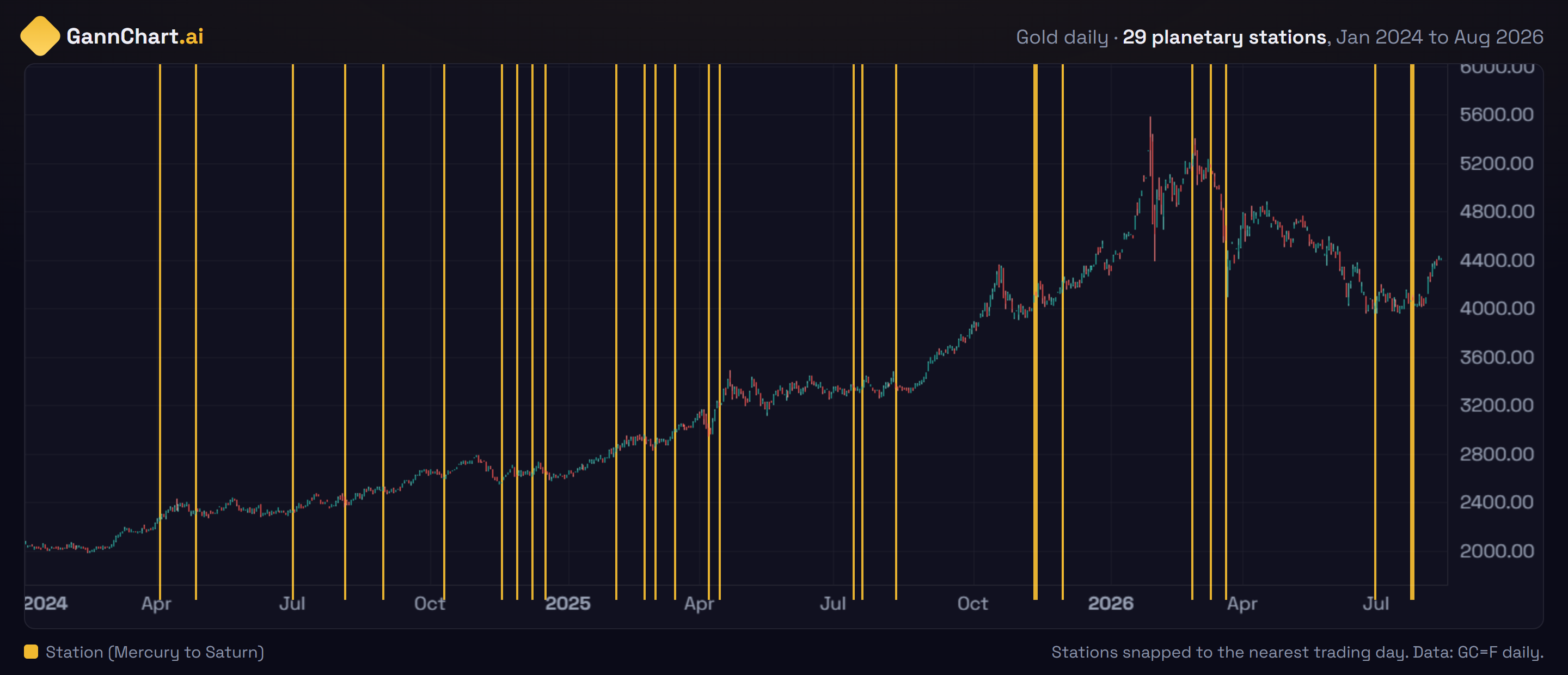
Look at it for a few seconds and the effect takes hold. Mercury stationed retrograde on 29 June 2026, and gold bottomed the next day. Saturn turned direct on 15 November 2024, one day after a low. Those are real, and you can check them. Your eye finds them, locks on, and the misses quietly stop counting as data. That is not dishonesty, it is just how pattern recognition works, and it is exactly why the claim needs a number rather than a look.
Here is the number for this window. Of these 29 stations, 24 land within three days of some swing pivot, which sounds decisive until you ask how much of the chart qualifies. Against the major turns only, the ones a trader would actually care about, just 5 of 29 hit, in a band covering 19.1% of the chart. That is 17%, slightly below chance.
Two things make this a fair test. It is directional-agnostic, so we are not asking the station to tell us whether a high or a low is coming, only that a turn is near. And it is generous, because we allow a tolerance window either side of the station rather than demanding the pivot land on the exact day. If the effect exists at all, this test should find it.
How we tested it
Stations. Mercury, Venus, Mars, Jupiter and Saturn, from 1 January 2005 to 14 August 2026. Sun and Moon are excluded because they never retrograde. The outer three (Uranus, Neptune, Pluto) are excluded from the test set to keep the sample to planets with meaningful speed variation. That gives 264 stations.
Markets. Daily bars for gold futures (GC=F), the S&P 500 (^GSPC), WTI crude (CL=F) and the Dow (^DJI). Roughly 5,430 bars each.
Pivots. A bar is a pivot if it is the strict extreme of a window of ±k bars around it. We ran k = 5, 10, 20, 40, from minor swings up to major multi-month turns.
Tolerance. A station counts as a hit if a pivot falls within ±1, ±2 or ±3 trading days.
The baseline. This is the part that matters most. For each configuration we drew the same number of random trading days from the same date range and measured their hit rate, repeated 3,000 times. The p-value is simply the fraction of random draws that scored at least as well as the real stations.
Our very first run reported that station dates hit a gold pivot 69.9% of the time. Read on its own, that number looks like a discovery, and it is exactly the kind of number that ends up in a course.
Then we ran the random baseline: 67.4%. The pivots were so dense that two thirds of every trading day in the sample sat within three days of one. The station dates were not finding turns. They were just landing on a chart where turns are everywhere.
A hit rate with no baseline beside it is not evidence. It is decoration.
That is easier to see than to explain. This is the same gold chart, same station lines, with every swing pivot marked and the three-day window around each one shaded:
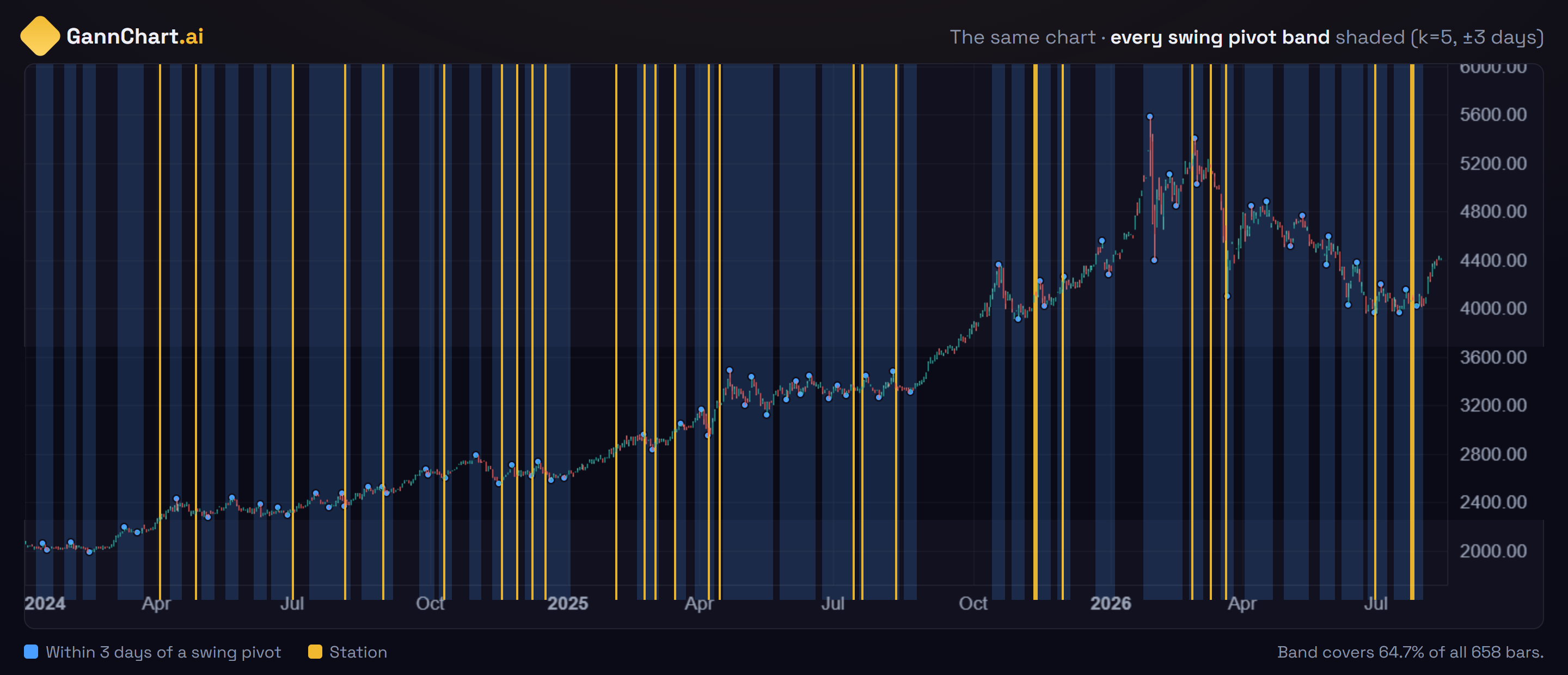
The chart is drowning in blue. Drop a vertical line anywhere and it lands in the band about two times in three, whether it is a station, a full moon, your birthday, or a number you made up. The station lines do sit in blue regions, and that fact is worth precisely nothing, because almost everything does.
This is why the whole study is built around the baseline rather than the hit rate. The question is never "did the stations hit?" It is "did they hit more than the blue band alone would predict?"
The result
Forty-eight configurations. Every one of them plotted below: horizontal position is the lift over the random baseline, where 1.0 means the stations did exactly as well as chance. Vertical position is the p-value, with more significant results higher up.
Thirteen of the 48 configurations produced a lift above 1.0, which is roughly what you would expect from noise alone, and none of those thirteen came close to significance. There is no subset of markets, no pivot definition, and no tolerance window in this sweep where the effect appears. That consistency is itself informative: a real but weak effect would usually show up somewhere and stay there as you vary the parameters. This one shows up nowhere.
Show all 48 results as a table
| Market | k | Tol | Pivot band | Stations | Random | Lift | p |
|---|
"Pivot band" is the share of all trading days already sitting within the tolerance window of some pivot. It is the number the station hit rate has to beat.
Run the baseline yourself
The single most useful habit this study can give you is the reflex to ask "compared to what?". Pick any configuration below and draw random dates against it. The gold marker is what the real stations scored. Watch where it lands in the distribution of pure chance.
Where this could still be wrong
A null result deserves the same scrutiny as a positive one, so here is what this study does not establish.
- Daily bars only. If stations matter on an intraday scale, or on weekly and monthly charts, this test would not see it.
- One family of pivot definitions. Fractal extremes are standard, but a different definition (ATR-scaled swings, ZigZag, structural break points) could in principle behave differently.
- Geocentric tropical longitude only. Heliocentric stations do not exist by definition, but sidereal or declination-based turning points are untested here.
- Co-incidence, not profitability. We asked whether pivots cluster near stations. Even a positive answer would not have implied a tradeable edge, which is a much higher bar involving direction, entry, and risk.
- Four markets. Broad and liquid, but not exhaustive. Single stocks and FX are untested.
- These specific planets. Mercury through Saturn. The slow outer planets station too rarely in a 21-year window to test on their own.
Most importantly, this tests one claim: that a station date by itself marks a swing pivot. It says nothing about planetary longitude mapped to price levels, about station-to-station time cycles, or about any method that combines an astronomical input with price structure. Those are different hypotheses and they need their own tests. A null result on one method is not a verdict on all of them.
What actually survives
Strip away the claim that failed and something more defensible is left standing.
A station is a time coordinate. It marks a date on the calendar that was fixed by orbital mechanics centuries in advance, is identical for every trader on Earth, and cannot be curve-fitted after the fact. That is a genuinely unusual property for anything in market analysis, and it is the reason these dates are worth having on a chart at all.
But a coordinate is not a signal. Gann's own framing was never that a date produces a turn. It was that time and price must meet. A date on its own predicts nothing. A date that arrives while price is sitting on a level derived independently is a different proposition, and critically, it is a falsifiable one, because the level either holds or it does not.
That is the distinction we build on. The planetary line method does not ask when a planet turns. It maps a planet's longitude onto a price, which produces a level you can be wrong about tomorrow morning. The Square of Nine does the same thing from a different direction. Both make claims that price can refute. "The market turns near a station" is much harder to refute, which is precisely why it survived unexamined for so long.
Concretely, this is the difference. Same market, same planets, but every line here is a price:
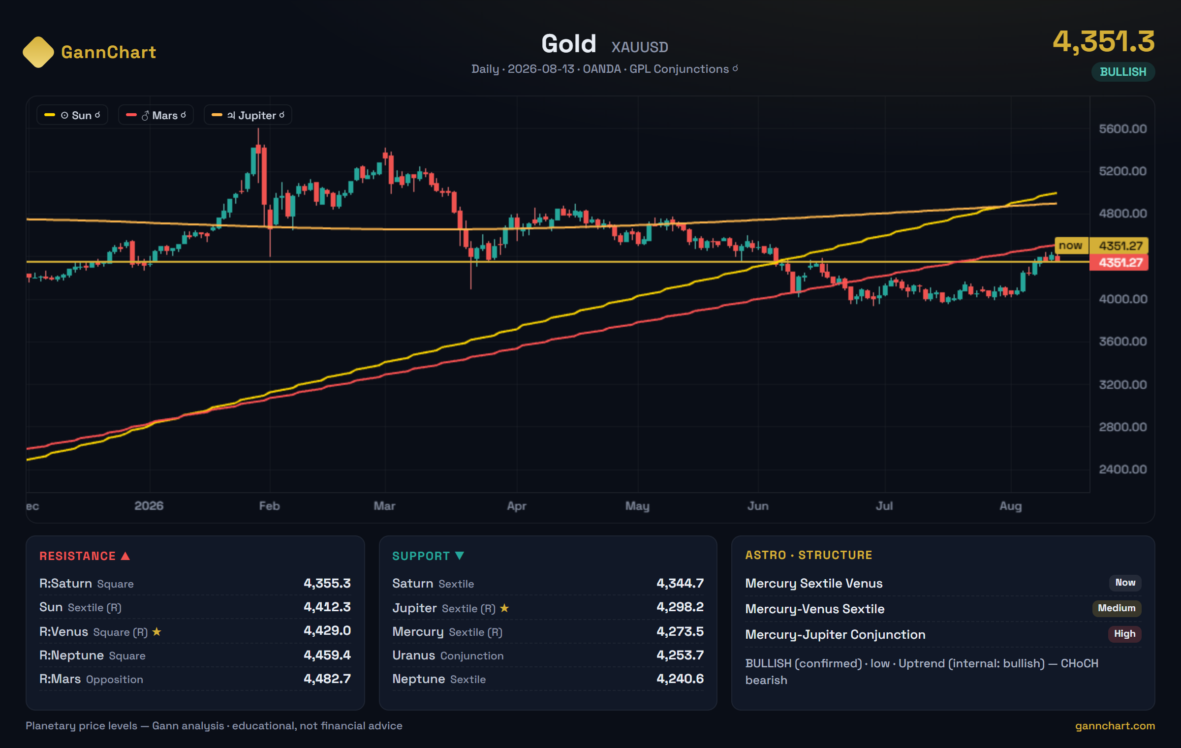
Saturn sits at 4,344.7 as support and 4,355.3 as resistance. Those are commitments. By the end of the week price has either respected them or run straight through, and no amount of interpretation changes which. A station date offers nothing to check, which is comfortable for whoever is selling it and useless for whoever is trading it.
Use stations as dates on the calendar, not as entries. If a station arrives while price is already sitting at a level you derived independently, that is worth your attention. If a station arrives and nothing else is happening, the data in this article says it is just a Tuesday.
Every station, 2026 to 2028
Since the dates themselves are still useful, here they are. Computed to the minute from the same ephemeris as the rest of this article, covering Mercury through Pluto.
Reproduce it
Everything here is checkable. The station dates come from a standard ephemeris, so any astronomical library will confirm them. The market data is public. The test is about forty lines:
If you run this on a market we did not cover and find something, we would genuinely like to see it. The interesting outcome of publishing a null result is the chance that someone shows you where you were looking in the wrong place.
Real ephemeris. Levels you can be wrong about.
GannChart.ai computes planetary lines, Square of Nine levels and station dates from live astronomical data across 17 markets. Every level is a number price can refute by tomorrow.
Start at GannChart.aiQuestions people ask
So retrogrades are meaningless for trading?
This test rules out one specific thing: that a station date on its own marks a swing pivot in a major liquid market on a daily chart. That is the version most commonly taught, and it did not hold up. It does not rule out longitude-to-price methods, time cycles measured between stations, or anything that combines an astronomical input with price structure. Those are separate claims and they deserve separate tests.
Why did the first run look so good?
Because swing pivots are dense. With a common pivot definition and a three-day window, about two thirds of all trading days already sit near a pivot. Any set of dates you choose will appear to "hit" roughly 67% of the time. Without the baseline beside it, that number reads as a strong result when it is really just the background rate of the chart.
Would a wider orb have helped?
It makes the hit rate go up and the evidence go down. Widening the window raises the station hit rate and the random baseline together, because both are measured against the same band. We tested one, two and three trading days; the lift stayed flat throughout. Past roughly three days the band swallows most of the chart and the test stops being able to distinguish anything at all.
How exact is a station date really?
The instant is exact to the minute, but the planet is close to stationary for days around it. Mercury sits below a quarter degree per day for a median of eight days, Venus for nine, and Mars for thirteen. Quoting a station to the minute is technically correct and practically false precision.
Why publish a result that works against your own product?
Because the alternative is worse. A tool that computes astronomical data accurately is only worth anything if the claims around it are accurate too. We would rather remove one popular claim than have every other number we publish inherit its credibility problem. The methods we do stand behind make falsifiable statements about price, and those we are happy to be tested on.
Glossary
- Station
- The instant a planet's apparent angular velocity crosses zero, seen from Earth. Written SR (station retrograde) when direct motion turns retrograde, SD (station direct) when it turns back.
- Retrograde
- Apparent backward motion against the fixed stars. A perspective effect caused by the relative motion of Earth and the planet, not a real reversal of orbit.
- Ecliptic longitude
- A planet's position measured 0 to 360 degrees around the plane of Earth's orbit. The coordinate every Gann planetary method is built on.
- Swing pivot
- A bar that is the highest high or lowest low of a window around it. Larger windows mean fewer and more significant pivots.
- Lift
- The observed hit rate divided by the random baseline hit rate. A lift of 1.0 means the signal did exactly as well as chance.
- Null model
- A simulation of what the result would look like if the signal carried no information. Without one, a hit rate cannot be interpreted.
- p-value
- Here, the share of random draws that scored at least as well as the real stations. Low values mean the result would be unlikely to arise by chance; 0.05 is the conventional threshold.
Method notes and sources
- Station instants computed from the same ephemeris engine used in the GannChart.ai application, via geocentric ecliptic longitude, with sign changes bisected to the minute.
- Daily OHLC data for GC=F, ^GSPC, CL=F and ^DJI, 1 January 2005 to 14 August 2026, approximately 5,430 bars per market.
- Pivot definition: strict fractal extreme over a window of ±k bars, k = 5, 10, 20, 40.
- Null model: 3,000 uniform random draws per configuration, matched on sample size and date range. p-value is the share of draws scoring at or above the observed station hit rate.
- Sample: 264 stations of Mercury, Venus, Mars, Jupiter and Saturn. Between 253 and 259 fell inside the testable index range of each market after edge trimming.
- W.D. Gann, The Basis of My Forecasting Method (1935), for the time-and-price framing referenced in the closing section.